Articles, Demos, Guidance
Articles about Azure Charts
-
Cloud Charts Manifesto
Guiding principles of the project are stated in Cloud Charts Manifesto. This article describes the main drivers behind Azure Charts project and the basis ideas of the implementation. -

Measuring the cloud: dimensions of cloud state in Azure Charts
Based on ideas from Cloud Charts Manifesto, Azure Charts project communicates current cloud state in terms of dimensions, services and VM instance types are measured in. -
Cloud state representation patterns in Azure Charts
Main patterns introduced in Azure Charts project to test the ideas stated in Cloud Charts Manifesto and to create a cloud state communication channel for Microsoft Azure. -
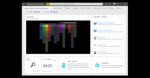
Adding Azure Charts quick links to your Azure Portal dashboard
Azure Portal dashboard is a great way to create a focused workspace for your day-to-day activities related to Azure. If you use Azure Charts tools regularly, you can add the shortcuts to them to your dashboards. -
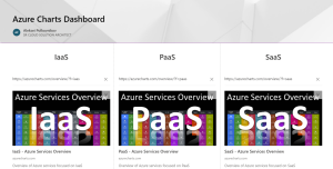
Azure Charts Shortcuts on SharePoint
Here is some guidance on how to easily organize and share the charts you use most frequently at your SharePoint site using Link Preview web part. -

Cloud topics and trends on Azure Charts
There is a variety of cloud topics which are important to us. Some of them are evolving very fast and will likely form the future of the cloud, makes sense to keep an eye on them. -

Learning Azure with Azure Charts
To help learning Azure in a focused way and staying up-to-date in your knowledge, there is a suite of interactive charts introduced recently which you can find under the Learning menu in the navigation bar. -

One focus, many angles: Azure Service 360° of Azure Charts
Is there an Azure service that is currently most important for you? If there is one (or a couple), you are likely interested in most essential stats for it on a single pane of glass. -
Explorer's guide to Azure using Azure Charts
How to use charts based on Guided Exploration Map (“Explorer”) pattern: Azure Solution Explorer, Azure Template Explorer, Azure Customer Story Explorer, Azure Learning Explorer.